
Furry Buddy is a concept mobile app that matches an adopter with the right pet.

The Design Challenge
Millions of animals are currently in shelters and foster homes awaiting adoption. Design an experience that will help connect people looking for a new pet with the right companion for them. Help an adopter find a pet which matches their lifestyle, considering factors including breed, gender, age, temperament, and health status. Provide a high-level flow and supporting wireframes.

The Process
This design challenge was completed on my own during 8 hours of work. I used this UX Framework to help me solve the problem and to make informed decisions when designing high-level wireframes for the app.
Learn
For the learn phase I wanted to find out as much as I could about pet adoptions, as well as doing a competitive analysis of apps that already match pets to adopters. Finally I conducted a quick one question survey.
Research
Some Important Data to Know:
According to the ASPCA, approximately 6.5 million companion animals enter U.S. animal shelters nationwide every year. Of those, approximately 3.3 million are dogs and 3.2 million are cats. Each year, approximately 1.5 million shelter animals are euthanized. APPA reports that 34% of dogs are purchased from breeders, while 23% of dogs and 31% of cats are obtained from an animal shelter or humane society. According to the ASPCA’s National Rehoming Survey, pet problems are the most common reason that owners re-home their pet.
Why Do People Shop for Pets Instead of Adopting?
According to Civic Source, 15% of potential adopters think they might have behavioral issues, 6% because of the adoption fee, 6% want a puppy/kitten, 5% want a purebred pet, and 4% think they might have health issues.
Competitive Analysis
I researched what apps out there already match adopters with pets. These are: Bark Buddy, Paws Like Me and Woof. I analyzed what their functionality and features were in order to take the best practices and to also improve upon them in the development of Furry Buddy.

Out of Category
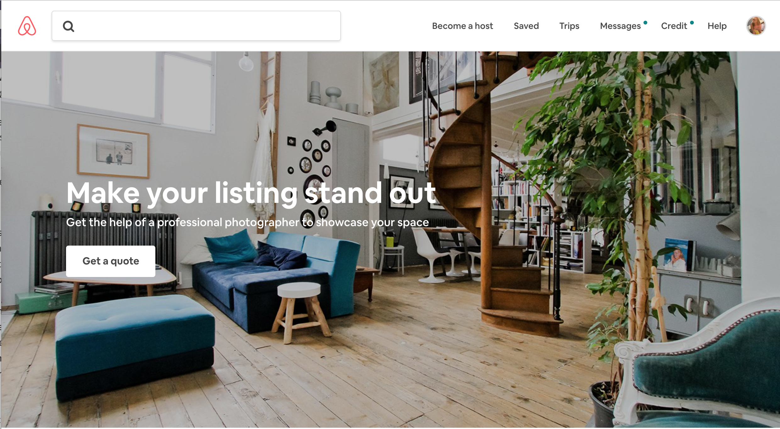
I wanted to take a concept that really worked for Airbnb when they first started out. They recognized the importance of great photography to sell something that isn’t tangible yet. They provide information on how to do it well, but they can also connect you with a professional photographer to take care of it for you. Listings with professional photos are booked almost 3 times more than ones that don’t. This same concept could apply to pet photos and adoption rates.
Survey
I did a quick 7 person survey to define if the problem would be better solved for the user as a website or an app. It turned out that 4 out of 7 adopters would rather get matched with potential pets through an app over a website.
Define
For the define phase I analyzed what I found out from the research, and got to write the problem statement, assumptions, personas, and the UX strategy. With this information I was also able to develop a high level user flow.
Problem Statement
The general public is widely misinformed about the advantages of adopting a pet over buying one. As a result millions of pets are still waiting for their forever homes in overcrowded shelters. A lot of these animals will be euthanized.
Assumptions
I believe users have a need to be sure that they will adopt the right pet for them.
I believe these needs can be solved with a compatibility quiz that provides them with accurate pet matches.
I believe the values users want to get most out of the app is a quick and convenient accurate pet match.
I believe the biggest product risk is that the matching algorithm doesn’t provide them with a correct pet.
We will solve this through testing and making sure that it’s as accurate as it can possibly be.
The app will combine what the competition does best and add what is missing.
Personas
Two main personas were created based on the quantitative and qualitative research to define the majority of possible adopters.

UX Strategy
I developed 3 main points for the UX strategy to help guide the objectives of the app.
Educational Adopters are educated about the benefits of shelter pets v.s. puppy mills and breeders. All preconceived ideas are vanished, leading to greater chances for adopting.
Social Engagement Adopters are engaged and satisfied with the match results that they tell all of their friends and family to download the app and join them in adopting. More pets are saved.
Aesthetics & Modern UI A picture is worth a thousand words, and when it comes to getting a pet adopted it could be a matter of life or death. Outdated design is a red flag for the modern user, with modern UI we will communicate digital trust before meeting your future pet in real life.
User Flow Sketches
After conducting research, a competitive analysis, a survey, defining the problem, assumptions, personas and UX strategy, I was able to start sketching what the app’s high-level flow and features could be.

Design
User Flow Wireframes
After putting thoughts on paper I was ready to move on to Sketch. I can try different ideas faster. I continued thinking about the flow of the app and what features are important for the UX Strategy. Ideally I would also do a User Journey Workshop to gather feedback and more feature ideas, as well as conduct a MVP session.

Onboarding Wireframes
For the onboarding screens I chose to make the content about education that other apps lack and delivering the value proposition of adopt don’t shop. I would like to test if users are overwhelmed by the amount of text and/or if they rather have a walkthrough of app features instead.

User sees delightful animations to engage with the app and the outcome: a cute pet.

User has control, can skip the entire onboarding or move to the next screen and also knows how many screens exist.

Call to action button at the end that goes to the main feature of the app: the personalized pet match quiz.
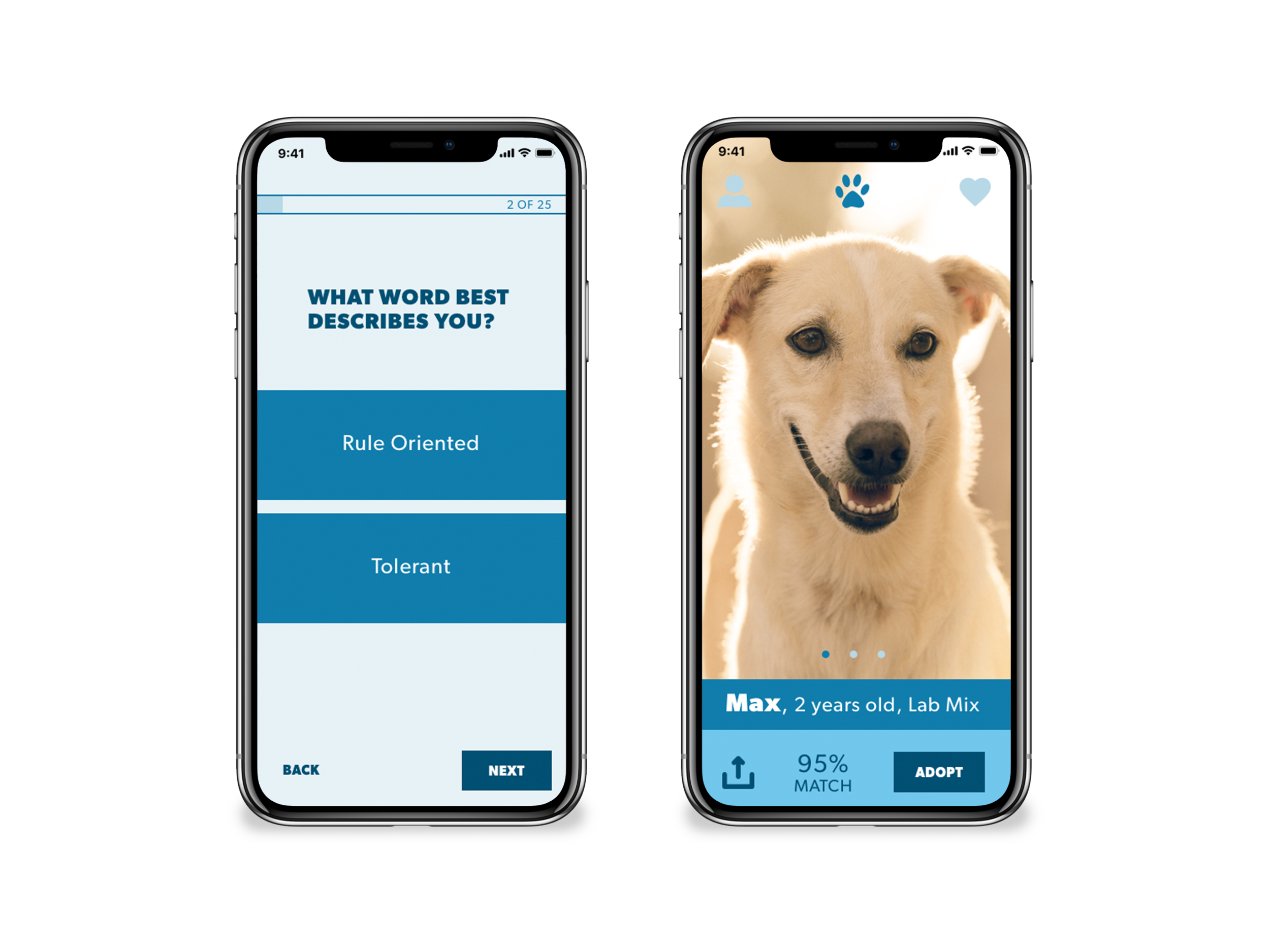
Personalized Pet Matches Quiz Wireframes
In the last onboarding screen users are encouraged to take a quiz to get pet matches based on their personality and lifestyle (this includes factors like breed, gender, age, temperament, and health status).
They are asked 25 questions, one question per screen. Some factors I considered to structure it this way are: no need to scroll, the user gets a sense of accomplishment from each question, cleaner and more focused design for mobile. It would be recommended to ask users if they prefer it this way too.

User has control (can go back and next, also knows what stage of the quiz they are in.

With a calculating results animation, the user can expect that the system is working hard at providing him or her the best pets.
Personalized Pet Matches Quiz Wireframes
In the last onboarding screen users are encouraged to take a quiz to get pet matches based on their personality and lifestyle (this includes factors like breed, gender, age, temperament, and health status). They are asked 25 questions, one question per screen. Some factors I considered to structure it this way are: no need to scroll, the user gets a sense of accomplishment from each question, cleaner and more focused design for mobile. It would be recommended to ask users if they prefer it this way too.

User has control. If they skip the quiz they still get to see pets but they are not filtered or rated by % to their lifestyle.
User can see the benefit of the effort of doing the quiz: % ratings of pets that match their lifestyle.

Once the user clicks on the name of the pet or the match % the entire section would expand with important info about the pet.
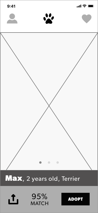
Pet Matches Wireframes
For the pet match screens it works like most dating apps out there. Swipe right to adopt, swipe left not interested. Users will get a quick animation of how this works before they get their first match. The match screen intends to highlight the most important call-to-action: adopt. Sharing is also a very important part. It would be great to test what users expect to see when they hit either of these buttons. Is it what I thought or something else? I would change it to what most users expect.

User can select to fill in the application, or find out specifics by calling the shelter. They can also see the shelter’s website.

User gets further education about how sharing can save a life and also reiterates why adopt is better than shop by breaking down myths.
Profile and Favorites Wireframes
The main navigation is Profile, Matches and Favorites. For the profile screen, the user can edit it and they can also redo the quiz if they change their mind, I also want to reiterate to share the app for social engagement and somewhere where they can contact and see questions that they probably have before committing to adopt. For the favorites screen user gets a list of all pets that have been favorited so far, and gets a direct link to the pet’s profile. This allows for a better decision-making process and a way to contact the shelter again.

User can see their profile if they click on their photo.

List of favorites is ordered by match % to help the user prioritize their matches.
High Fidelity Comps
Ideally before moving to this step, we would have done user testing to validate assumptions, and iterate based on feedback, therefore moving up the truth curve.
One question at a time, reduces cognitive load. Also Photography that wins over hearts. They can be compared to photos that marketing savvy shops use.
Next Steps
I would have to continue doing user testing with prototypes. And then proceed to re-design based on feedback in a continuous loop. And finally build and launch the app.